
22-10-2025
Color Models in Industry: the science behind chromatic perfection
Color communication represents a fundamental challenge for companies operating in industrial contexts. The ability to specify, reproduce and control colors in a precise and repeatable way often determines the quality of the final product and the efficiency of production processes. For this reason, over the years, various color models have been developed, each designed to meet specific needs and optimized for particular application sectors.
What are Color Models?
Color models, also called color systems or color spaces, are standardized methods for defining, cataloging and communicating colors in a unique and reproducible way. They are essentially shared languages that allow professionals from different sectors to refer to the same color without ambiguity, regardless of the medium used or the reproduction technology.
Each model is based on different principles: some describe color through numerical coordinates in a three-dimensional space, others use physical reference swatch books, still others are based on human visual perception. The choice of the most appropriate system depends on the application context, production technology and the company’s quality control requirements.
What are the Color Systems?
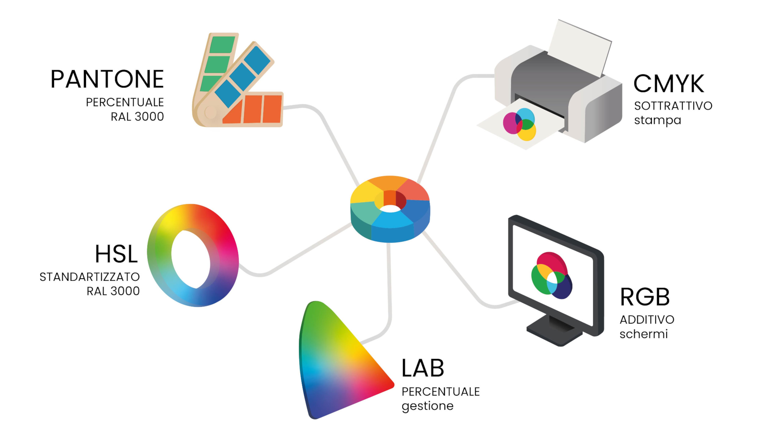
In the industrial landscape there are numerous color models, but some have established themselves as reference standards for specific sectors.
The main systems used include:
- Pantone: the most widespread system in the world of printing, graphic design and textiles,
- RAL: the European standard par excellence in the paint, coatings and architecture sector,
- NCS (Natural Colour System): based on human visual perception, particularly appreciated in architecture and interior design,
- CIE Lab*: the reference mathematical model for instrumental color measurement,
- RGB: the additive system used for all light-emitting devices, from screens to projectors,
- CMYK: the standard subtractive model for offset and digital printing,
- HSB/HSL: alternative representations useful for digital color manipulation.
Each of these systems has distinctive characteristics that make it more or less suitable for specific industrial applications.
Pantone: the worldwide reference for design and printing
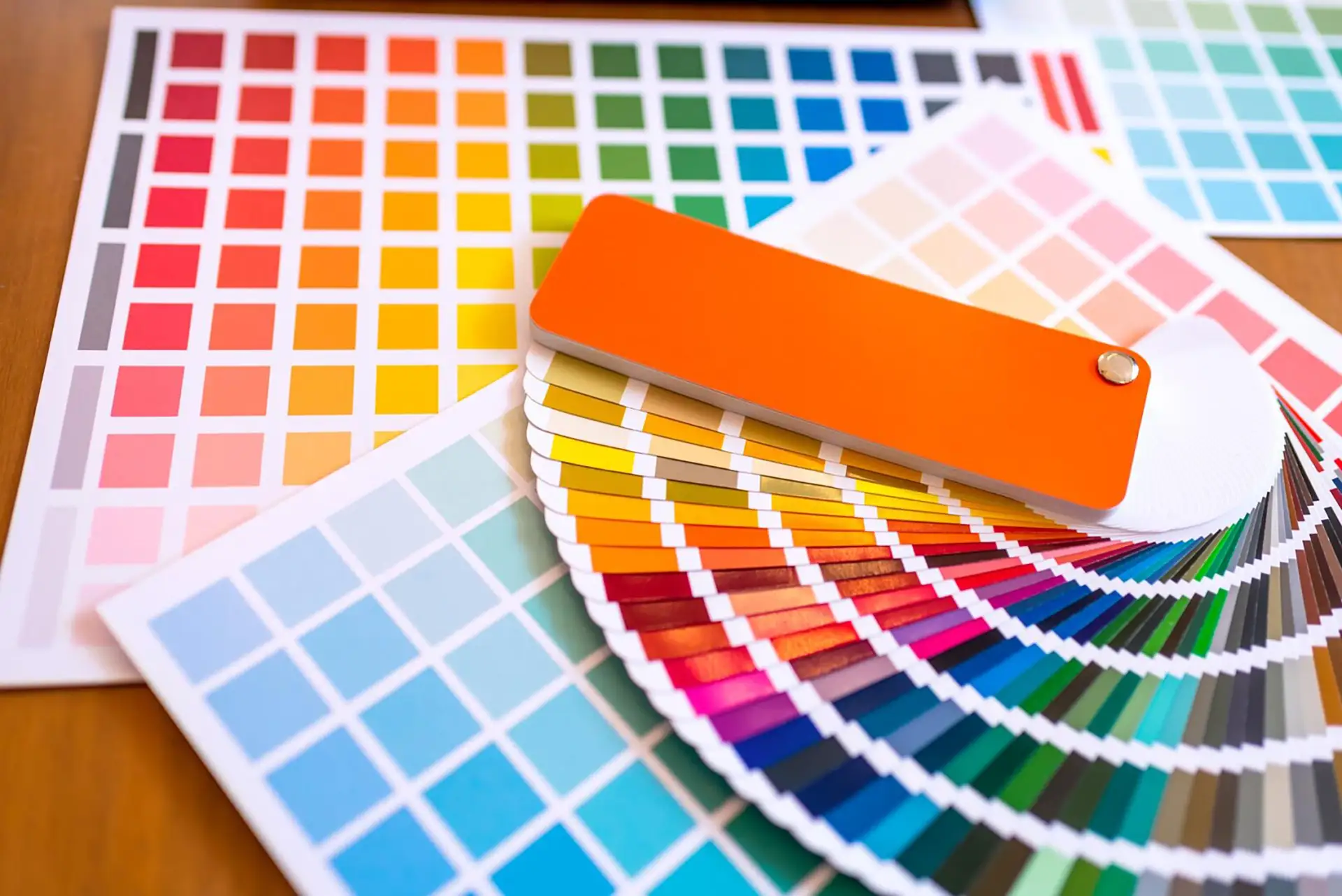
The Pantone system probably represents the best known among proprietary color models. Developed in the 1960s by the American company Pantone LLC, this system is based on physical swatch books of premixed colors that guarantee extremely precise visual correspondence.
The strength of Pantone lies in its ability to reproduce colors through specific inks, avoiding the chromatic variations that can occur with traditional four-color processes. Each color is identified by a unique code, consisting of a number possibly followed by a letter indicating the type of substrate (C for coated, U for uncoated, TPX or TCX for textiles).
In the industrial context, Pantone finds application mainly in these areas:
- Printing and packaging: when maximum chromatic fidelity of the corporate brand is required,
- Textiles and fashion: for the precise definition of seasonal collections,
- Product design: as a reference for communication between designer and manufacturer,
- Brand identity: to ensure chromatic consistency of the brand across all media.
The main limitation of the Pantone system is its proprietary nature, which requires the purchase of official swatch books and involves licensing costs for use in some professional software.
RAL: the European standard for paints and coatings
The RAL system was born in Germany in 1927 and has established itself as the reference standard for the paint, industrial coatings and architecture sector throughout Europe. The name derives from “Reichs-Ausschuss für Lieferbedingungen”, the German committee that developed it.
The RAL Classic system, the most widespread version, includes 213 colors identified by a four-digit numerical code preceded by the RAL abbreviation. The first digit indicates the chromatic family: 1 for yellows, 2 for oranges, 3 for reds, and so on. This systematic organization facilitates orientation within the swatch book.
Alongside RAL Classic, there are more recent and articulated systems:
- RAL Design System: offers 1,825 colors organized according to parameters of hue, brightness and saturation,
- RAL Effect: includes 420 solid colors and 70 metallic ones for decorative applications,
- RAL Plastics: specifically calibrated for plastic materials.
RAL is particularly appreciated in the industrial sector for its ease of use, the stability over time of formulations and the wide availability from paint manufacturers. It represents the ideal choice for metal carpentry, fixtures, industrial coatings and any application where a solid and universally recognized reference is needed.
RGB: the additive model for digital
RGB is the acronym for Red, Green, Blue, the three primary colors of light which, combined in different proportions, allow the reproduction of the entire visible spectrum. This system is defined as “additive” because the overlapping of the three components produces white, while their absence generates black.
Each color in the RGB system is defined by three numerical values, typically ranging from 0 to 255, which indicate the intensity of each chromatic channel. For example, pure red is represented by RGB (255, 0, 0), while yellow is obtained by combining red and green with RGB values (255, 255, 0).
The main application scope of RGB includes:
- Monitors and displays: all devices that emit light use this system,
- Video projectors and LED screens: for professional installations and digital signage,
- Digital photography: in image capture and processing,
- Web interfaces and apps: for defining colors in the digital realm.
It is essential to understand that RGB is a device-dependent model, meaning chromatic rendering depends on the technical characteristics of the device used. For this reason, in the printing and physical production industry it is necessary to convert RGB files to other color spaces before production.

CMYK: the subtractive system for printing
The CMYK model takes its name from the four inks used in industrial printing: Cyan, Magenta, Yellow and Key (black). Unlike RGB, this system is “subtractive” because the inks absorb certain wavelengths of reflected light, subtracting them from the visible spectrum.
The combination of the three subtractive primary colors (CMY) should theoretically produce black, but in practice generates a dark brown. For this reason black ink (K) is added, which ensures greater depth in dark tones and reduces printing costs.
Each CMYK color is defined by four percentage values, from 0% to 100%, which indicate the amount of each ink to be deposited on the substrate.
The model finds application mainly in these contexts:
- Offset and digital printing: for the production of catalogs, brochures and promotional material,
- Flexible packaging: when the use of Pantone colors is not economically sustainable,
- Editorial printing: for books, magazines and large-run publications.
A critical aspect of CMYK is its limited gamut compared to other systems: not all RGB or Pantone colors can be faithfully reproduced in four-color process. This phenomenon requires particular attention in the pre-press phase to avoid unwanted chromatic surprises.
HSB/HSL: intuitive representations of color
HSB (Hue, Saturation, Brightness) and HSL (Hue, Saturation, Lightness) are two alternative models for describing color in a way closer to human perception. Rather than being based on primary chromatic components, these systems use intuitive parameters that facilitate the selection and manipulation of colors.
The hue represents the pure color and is expressed as an angle on the color wheel, from 0° to 360°. The saturation indicates the purity or intensity of the color, ranging from 0% (gray) to 100% (pure color). The third parameter differs between the two models: brightness in HSB or lightness in HSL describes how light or dark the color is.
These systems are primarily used in software contexts:
- Graphics and photo editing applications: for intuitive color adjustments,
- Web development: to define harmonic palettes through angular relationships,
- Interface design: when creating controlled chromatic variations.
It should be emphasized that HSB and HSL are not independent models, but alternative representations of RGB, used mainly to facilitate creative work rather than to standardize industrial production.
NCS: the system based on visual perception
The Natural Colour System, developed in Sweden based on the studies of physiologist Ewald Hering, is distinguished by its unique approach based exclusively on human visual perception. Rather than starting from physical or technological principles, NCS describes how the human eye perceives and organizes colors.
The system is based on six elementary colors: white, black, yellow, red, blue and green. Each color is described through its similarity to these pure elements, using notation that expresses the percentage of black (nuance), chromaticity and hue. For example, the code NCS S 2050-Y70R indicates a color with 20% black, 50% chromaticity and a hue composed of 70% red and 30% yellow.
NCS finds particular application in these sectors:
- Architecture and interior design: for designing chromatically harmonious environments,
- Construction: as a standard for specifications and technical documents, especially in Scandinavian countries,
- Paint industry: many manufacturers offer NCS formulations alongside RAL ones.
The main advantage of NCS is its independence from specific technologies and its adherence to the way humans perceive and communicate color. However, like Pantone and RAL, it requires the purchase of physical reference swatch books.

Color Wheel 0° 360°
CIE Lab*: the universal language of colorimetry
The CIE Lab* system (or CIELAB) represents the reference mathematical model for instrumental color measurement. Developed by the Commission Internationale de l’Éclairage in 1976, this three-dimensional color space is designed to be device-independent and approximate human perception.
The model uses three coordinates: L* represents lightness (from 0 for black to 100 for white), a* describes the position between green (negative values) and red (positive values), while b* indicates the position between blue (negative values) and yellow (positive values). The Euclidean distance between two points in Lab space, called ΔE (Delta E), objectively quantifies the perceptual difference between two colors.
CIE Lab is fundamental in numerous industrial contexts*:
- Quality control: to verify chromatic conformity of products using spectrophotometers,
- Formulation: in the paint, plastics and cosmetics industry for the development of new colors,
- Color matching: to identify the formulation closest to a target sample,
- Automotive: to ensure chromatic consistency between different components of a vehicle,
- Textiles: in batch control and verification of light fastness.
The strength of Lab lies in its mathematical nature, which allows precise conversions to other color spaces and objective calculations of chromatic differences. Every professional color management system uses CIE Lab* as a reference space for conversions between different devices.
Color Models Compared
What is the difference between RAL and Pantone?
Although both are systems based on physical swatch books, RAL and Pantone present substantial differences that determine their use in distinct areas. RAL was specifically created for the paint and coatings industry, with formulations optimized for opaque materials and textured surfaces. Pantone, on the other hand, was developed for printing and subsequently extended to other sectors such as textiles.
From a structural point of view, RAL Classic offers a relatively limited but extremely standardized selection of 213 colors, identified by four-digit numerical codes. Pantone instead offers thousands of variants organized in different specialized collections (Solid Coated, Solid Uncoated, Metallics, Pastels, Neons, Fashion & Home).
The main differences concern:
- Reference sector: RAL dominates in construction, metal carpentry and industrial coatings; Pantone is the standard in the world of visual communication, packaging and fashion,
- Type of substrate: RAL is optimized for opaque surfaces and industrial paints; Pantone offers variants for coated paper, uncoated paper, fabrics and plastics,
- Cost: RAL is generally more accessible, while Pantone requires significant investments for different swatch books and software licenses,
- Availability: RAL paints are easily available at any professional paint shop; Pantone colors often require specific formulations or premixed inks.
There are no direct and reliable conversions between the two systems, as they are based on different substrates and technologies. Attempting to “translate” a RAL color into Pantone or vice versa inevitably leads to visible differences.
What is the difference between NCS and RAL?
NCS and RAL represent two philosophically different approaches to color cataloging, both very widespread in Europe but with distinct organizational logics. RAL adopts a pragmatic classification system based on chromatic families and sequential numerical codes, without an underlying perceptual logic. NCS, on the contrary, builds its organization around the way the human eye perceives and categorizes colors.
This difference in approach is reflected in practical applications. RAL, with its long history and proven reliability in the industrial paint sector, is the first choice for those who need a solid and universally accepted reference. NCS, thanks to its structure based on perception, facilitates the creation of chromatic harmonies and is preferred by architects and designers working on environmental design.
From a chromatic coverage perspective, NCS offers a wider range with over 1,900 shades in the complete system, while RAL Classic stops at 213 colors. However, both systems provide extended versions: RAL Design with 1,825 colors and NCS Index with 1,950 samples.
One aspect to consider is geographical distribution: RAL is dominant in Germany and Central Europe, while NCS enjoys greater popularity in Scandinavian countries and has a strong presence in the architecture sector internationally. Many professional paint shops are equipped to formulate in both systems, but immediate availability tends to favor RAL.
Which Model do I choose based on the Sector?
The selection of the most appropriate color system depends on the industrial sector, production technology and specific communication needs. Each application area presents peculiar requirements that favor certain models.
- Automotive industry: CIE Lab* represents the standard for quality control and formulation, allowing objective and repeatable measurements. Automotive manufacturers also maintain proprietary color catalogs, often correlated to RAL codes for standard painted components.
- Construction and architecture: RAL dominates for fixtures, metal facades and roofing, thanks to its reliability and wide availability from industrial painters. NCS is preferred in interior design and in defining palettes for architectural design, where the creation of chromatic harmonies is a priority.
- Printing and packaging: Pantone is irreplaceable when brand identity requires precise and reproducible colors, while CMYK is used for large-run printing where process economy prevails over maximum chromatic fidelity. CIE Lab* finds application in quality control of printed materials.
- Textile and fashion industry: Pantone Fashion & Home is the standard for communication between designers, manufacturers and contractors. CIE Lab* is used in dyeing batch control to verify conformity to approved samples.
- Plastics and raw materials: RAL Plastics is specifically calibrated for these materials, while CIE Lab* remains the reference for instrumental measurements and color matching during the development of new formulations.
- Digital and multimedia design: RGB is the only system usable for content intended for screens and luminous devices. For cross-media projects, it is essential to manage conversions to CMYK for printing or to other systems for physical productions.
The contemporary trend sees the integration of multiple systems within the same production process: color is initially defined through Pantone or RAL, measured and verified in CIE Lab* using instrumentation, and converted to RGB or CMYK for digital communication.
Modern color management tools allow managing these conversions minimizing losses of chromatic fidelity, albeit within the limits imposed by different gamuts.
Subscribe to newsletter
You might be interested

ColorWorkDesk: Measuring Color with Spectrophotometers
ColorWorkDesk: A Guide to Color Formulation in Colorimetry

Color Analysis in the Textile Sector: technologies and Industrial Applications

ColorWorkDesk CWD Server: The software that provides colorimetry services
The Densitometer in ink control: measurement, operation, and applications in industrial printing
The Colorimeter: precision and Color control in industrial applications

ColorWorkDesk: The Innovative Software for Color and Paint Management

ColorWorkDesk: How Spectrophotometers Work
Metamerism: what It is and how It affects Color Control

Color Perception: from physiology to Industrial standardization

ColorWorkDesk: How to Choose a Spectrophotometer

ColorWorkDesk: your colorimetry with our consulting

Light Booths: the fundamental tool for Color Quality Control
Ask for a free consultation
Our experts will contact you to show you a demo of our products
